المدة الزمنية 1600
Frederick Enterprises Airliner Logo (05.30.22)
تم نشره في 2022/05/30
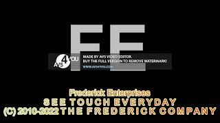
The Frederick Enterprises "Airliner" logo is so named because its austerity and emphasis on straight letters is reminiscent of the decor in an airport. It's an obvious Vestron Video-style logo, and even takes its music (in DM3), but it has its own unique traits as well. This is the first Frederick logo in a while to feature only the FE, and it differs from other Frederick Network and Frederick Enterprises logos in that it is made to fit a 16:9 rectangle while most other logos are made to fit in squares. This Frederick logo actually has a bit more of a history to it than most others, which are made on the fly to some degree. UNIVERSAL DISCLAIMER IN POEM FORM: All credit goes to their owners whoever they may be and all the FE logos are the only things from me!
الفئة
عرض المزيد


تعليقات - 0
مقاطع الفيديو ذات الصلة على Frederick Enterprises Airliner Logo (05.30.22):